
Why Are Your Brand Colours Important?
Colour is vital in helping to shape your branding. It's about so much more than aesthetics, the colours you choose can have a psychological effect to help consumers connect with your brand on a deeper level. Colours evoke certain emotions and say something about you and your brand so choose carefully. They help to represent who you are and what you stand for.
I'll be sharing some examples and basic colour theory below but I intend this to be a series, exploring each colour in depth. I've been wanting to write this for a while but it has taken a fair bit of research and organising to put together. I'm far from finished but I thought it was time to start posting as I know they will be useful whilst thinking about your visual branding.

What difference does colour really make?
According to a study performed by the University of Loyola, Maryland, “color increases brand recognition by up to 80 percent.” [sic]
Additional research shows that colour has a significant impact on sales since “people make a subconscious judgment about a product within 90 seconds of initial viewing and between 62% and 90% of that assessment is based on color alone.” [sic]
So yes, colour is a very important part of your brand as a whole. There is plenty of evidence about colour theory and the effects different colours can have on us humans, not just psychologically but physically too! It goes way beyond just what your brand looks like. Colours are a valuable tool to convey your values.
Not only that, but colour helps you to easily create a consistent image across all of your branding - from your website to social media to printed marketing materials and packaging, so your brand is instantly recognisable.
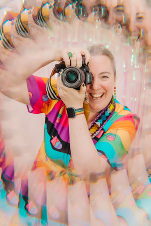
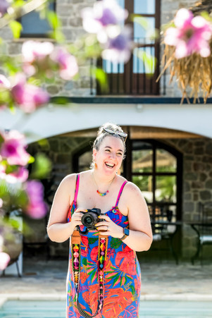
Take my own brand for example. I want to attract vibrant, energetic, joyful business owners and I love ALL the colours so rainbow colours is a no-brainer for me. It goes against the general rule of selecting just 2-3 main brand colours but it works for me and I love it! (Plus I like breaking rules when it comes to photography too, creativity and rules don't always mix!)

My brand profile when I was having my new logo made by Be Brave Branding, we did tweak the colours a bit more to work well on both light and dark backgrounds:

My brand is bright and full of eye-catching colour. I want to repel the corporate style brands who are looking for dull studio headshots with a plain background, which I definitely don't do.
Here are a few more of my own brand photos featuring my joyful rainbow vibe, some are self-portraits, others taken by photography friends and some during my own brand photoshoots in Chicago and Spain.


Well known brands and their colours.
When I tell you to think of a red drinks can, what do you immediately think of? Coca-Cola of course. Their brand is synonymous with red. It's bold and fun.
If you think of a little turquoise box, you know it's Tiffany. Luxurious and pretty.
What about a purple chocolate bar? Cadbury's right?
And it works both ways, if I said Barbie, you'd think pink.
Colour is so powerful, you really need to think about your brand colours carefully, choose something that you like yes, but consider the meaning behind the colour(s) too, their perception, how they might make people feel - make sure they fit with what your brand is all about.
Brand Colour Associations
Here's a quick rundown of some basic colour associations, each one will be featured in a more detailed blog post of its own soon...
When I ask you to think about how red makes you feel, what springs to mind? Probably both positive and negative connotations - passion and danger for example.
Yellow always strikes me as a happy colour. Blue is known to be calming and green is synonymous with nature, sustainability and the outdoors.
My own brand colours go against the norm, I have all of them! A multi-coloured palette conveys a sense of creativity, openness, informality and fun which fits perfectly with my photography brand and the clients I want to attract.
Here's a simple graphic of colour association examples:

For now, I'll leave you with a selection of my own bright and colourful rainbow images, just for fun! (All of these have been utilised for my brand in some way or another.) Come back soon for part two: RED.


