What separates a forgettable product photo from one that stops the scroll.
People often ask me if I photograph products on a white background. The kind you see on Amazon listings or web shops – clean, clinical, isolated.
Honestly? No. It’s just not where my heart is.
There are brilliant photographers who specialise in exactly that. But what excites me is something completely different: showing your products in a way that tells a story, creates a feeling and makes someone stop mid-scroll and think “I want that.”
Here’s how I approach it.
1. Let the Light Do the Work
Good product photography starts with light – always. I shoot in natural light wherever possible because it gives products a warmth and depth that artificial lighting rarely matches.
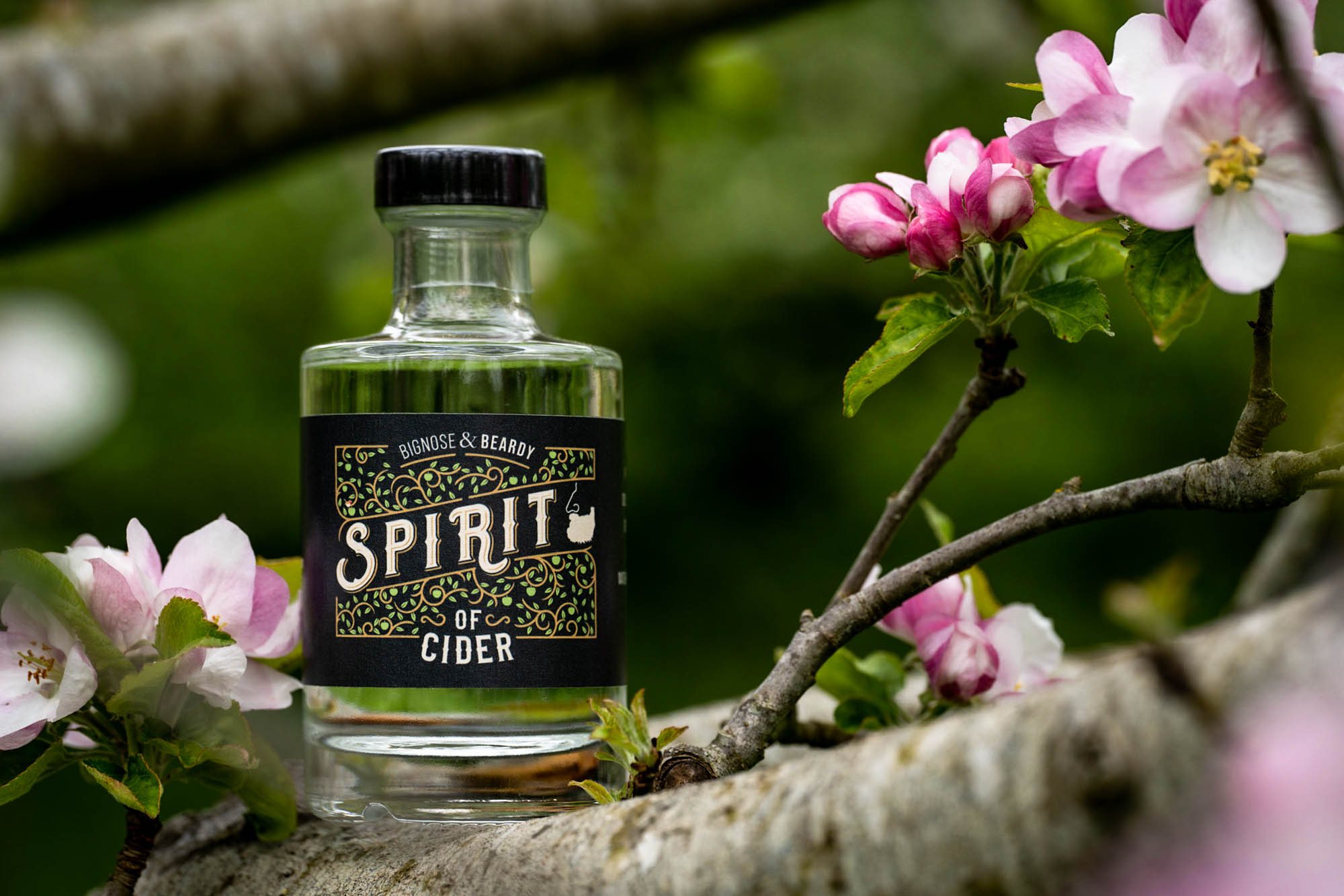
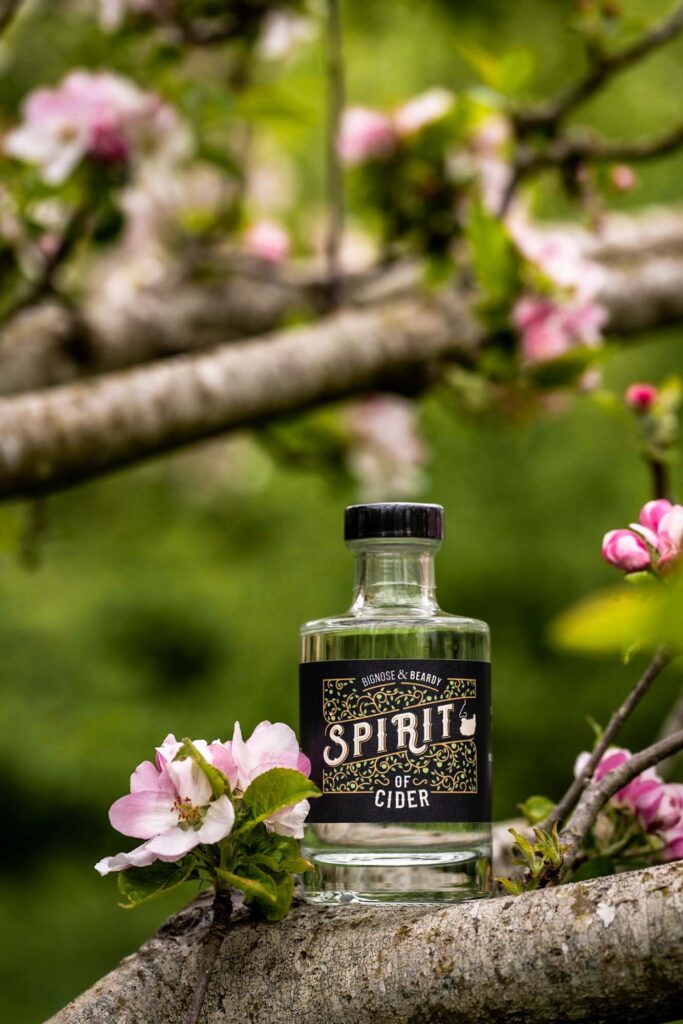
The time of day, the direction of the light, the way it falls across a texture or catches the edge of a glass – these decisions happen before I even pick up the camera. A bottle of Spirit of Cider photographed among the blossom, in the orchard where the apples grew, looks completely different from the same bottle photographed under a studio light. One tells a story. One doesn’t.
2. Style With Intention
Every prop, every surface, every background choice is a deliberate decision. Nothing should be in frame by accident.
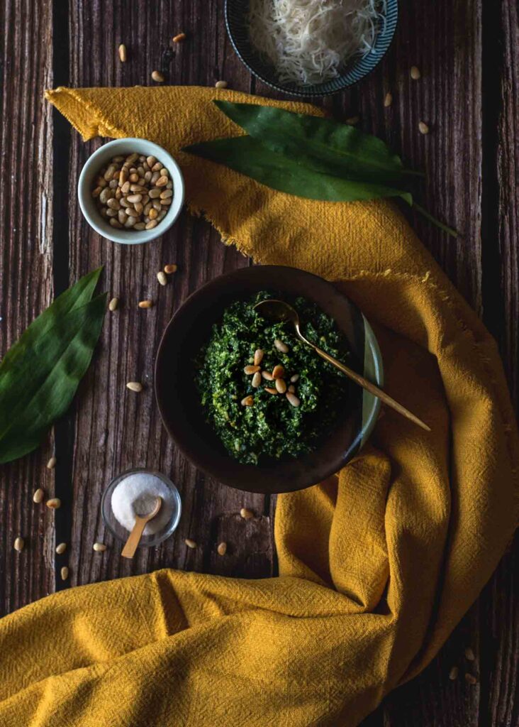
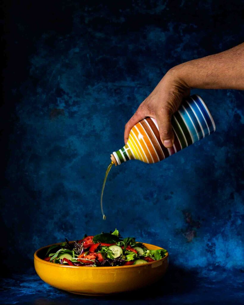
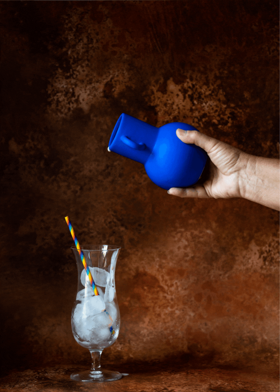
The yellow bowl with the rainbow oil pourer was chosen because the contrast between the warm yellow and the cool dark backdrop creates instant visual drama. The scattered pine nuts and wild garlic leaves tell you something about the food before you’ve tasted it. The styling does narrative work so the caption doesn’t have to.
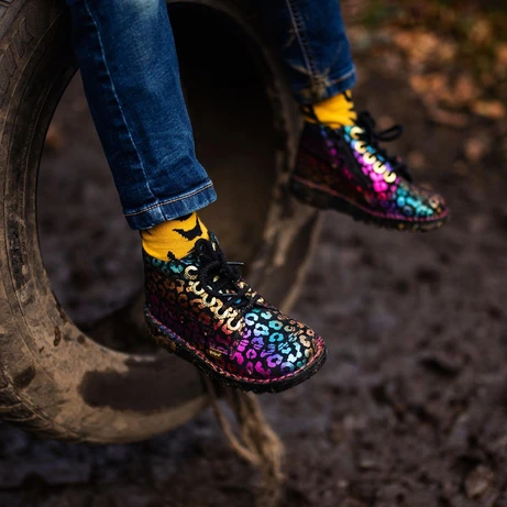
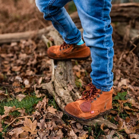
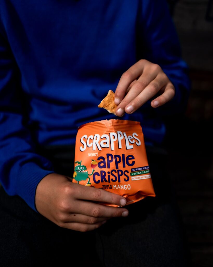
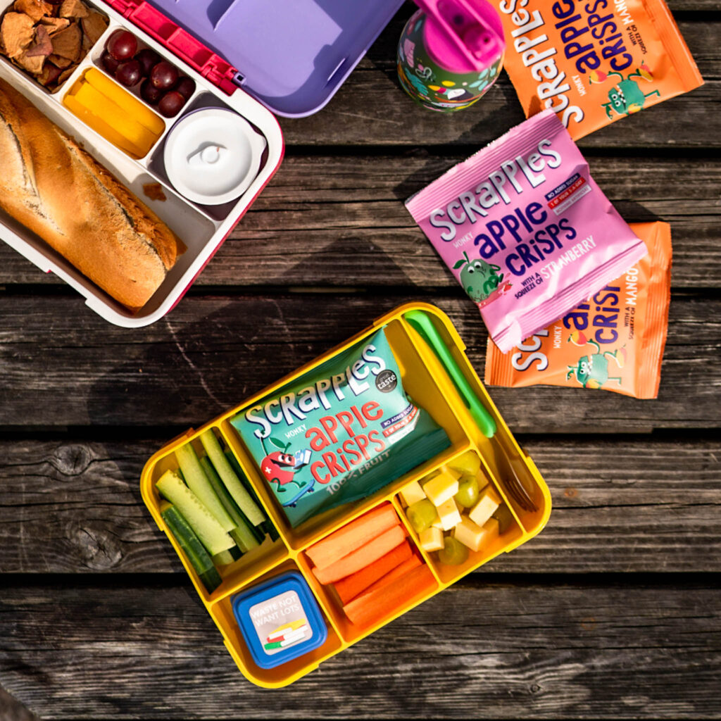
3. Show Products in Real Life
Some of my favourite product shots are the ones where the product is actually being used.
Kickers shoes don’t belong on a white plinth – they belong on muddy feet during an adventure. That’s what the brand is about, and that’s what the photo should show. When a product is shown in its natural habitat, doing what it was designed to do, it creates an immediate emotional connection with the right buyer.
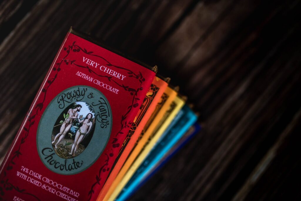
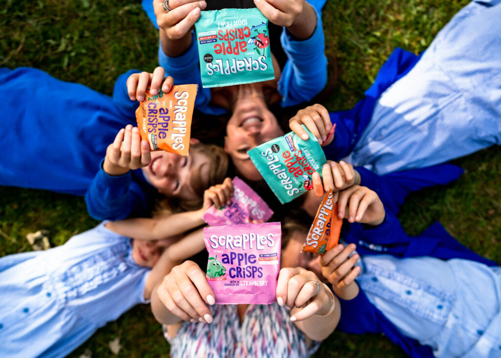
4. Play With Colour and Contrast
Colour is my superpower – and product photography is where I get to use it most playfully.
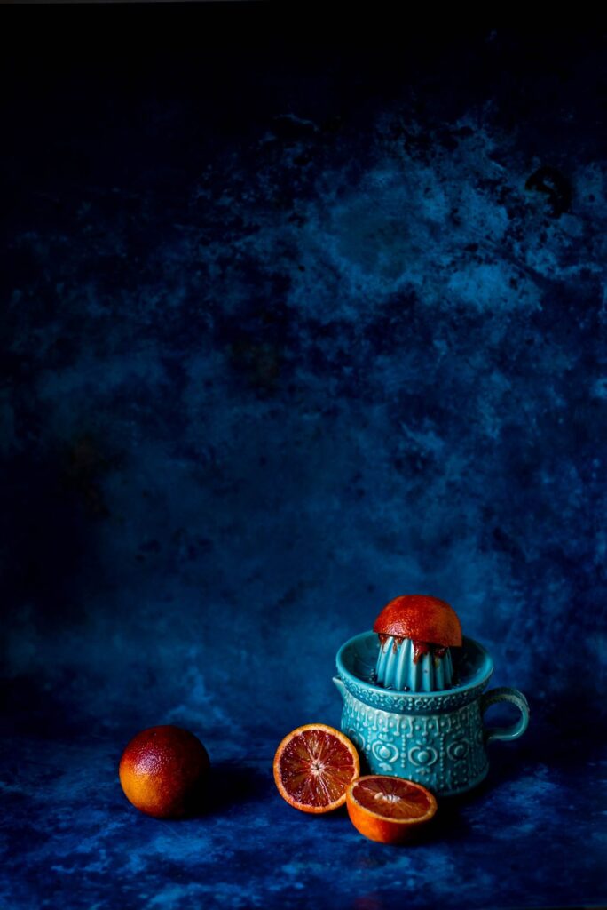
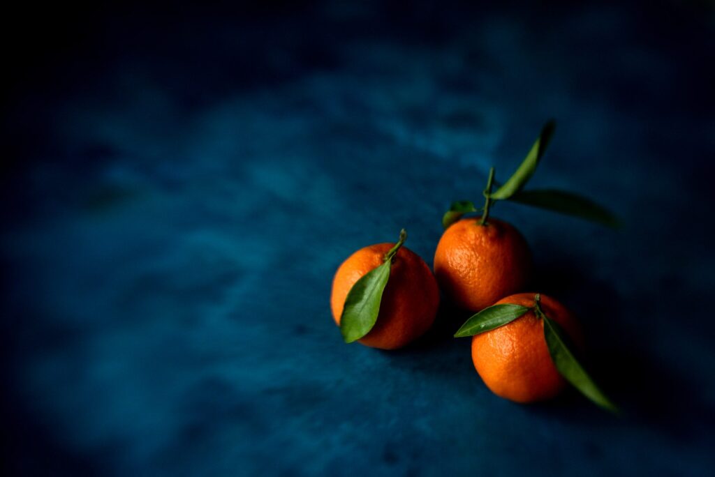
A rainbow of Rowdy & Fancy chocolate bars fanned out against dark wood. Blood oranges against a turquoise juicer on a blue backdrop. Christmas clementines on deep blue. The colour combinations aren’t accidental – they’re chosen to make each product the undisputed star of the frame.
5. Add Movement — GIFs and Cinemographs
This is one of my favourite things to create and one of the most underused tools in product photography.
A GIF or cinemograph takes a still image and adds a single, subtle movement – steam rising from a cup, liquid pouring, leaves blowing gently. Everything else stays perfectly still. The effect is mesmerising and performs brilliantly on social media because movement catches the eye in a way static images simply can’t.
6. Vary the Angles and Distances
A gallery of product shots all taken from the same distance and angle at the same height tells half a story at best.
I always aim for variety – a hero shot that shows the whole product beautifully, a lifestyle shot that shows it in context, a detail shot that gets close enough to show texture and craftsmanship, and a flat lay that shows it alongside complementary props. Together they give a brand everything it needs to show off its product across every platform and every format.
A Few More Favourites
Do your products deserve photography that makes them impossible to scroll past? Let’s have a natter.
Not sure where to start? A £99 Visual Brand Critique will tell you exactly what your current product imagery is missing.