
Part one of my series exploring how colour shapes your brand identity – and how to use it with intention
Red Attracts Attention. Always.
There’s no colour quite like red. It doesn’t ask for your attention – it demands it. And that’s precisely why so many of the world’s most recognisable brands have made it their own.
Red is dramatic. Passionate. Exciting. It’s associated with strong emotions at both ends of the spectrum – love and anger, desire and danger – and unlike most colours, it doesn’t just work on you psychologically. It works on you physically. Some studies suggest red can raise your heart rate and create a sense of urgency. It’s the colour of stop signs, sale signs and Valentine’s Day for very good reason.
For me, no other colour carries as many emotional connections as red. If you want your brand to be noticed, remembered and felt, red is a great place to start.

What Does Red Say About Your Brand?
If red is part of your brand palette, you’re telling your audience something specific:
You’re not here to blend in.
Red brands feel powerful yet classic – think of how timeless the Coca-Cola identity feels despite being over a century old. Red suggests action. It’s the colour of brands that mean business.
Red associations: bold, exciting, passionate, energetic, powerful, dramatic, urgent.
Well Known Brands That Use Red
Take a look at this list and notice how instantly recognisable every single one is – and how different they all feel despite sharing the same core colour:
Coca-Cola · Kickers · Colgate · Virgin · H&M · Netflix · Canon · Kellogg’s · Lego · Adobe
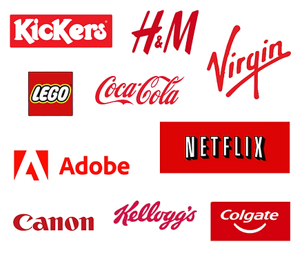
What’s interesting is the range. Coca-Cola uses red for joy and nostalgia. Virgin uses it for disruption and personality. Netflix for drama and excitement. Adobe for creativity and precision. The colour is the same, but what surrounds it and what the brand does with it changes everything.
Red in Real Life – A Photographer’s Perspective
I’ll be honest with you: red is one of the trickier colours to shoot and edit well.
It’s incredibly eye-catching in frame, but it can also be demanding. Certain shades of red can lose all their detail in harsh light, and it needs careful handling depending on the skin tones around it. Getting red to sing without overpowering everything else in the image takes a careful eye.
That said, when it works? It’s electric.
A red coat on a sunlit city street. Red Kickers on a climbing frame. A red toadstool in damp woodland. Red apples piled high. Red always stops the eye – which is exactly why it’s such a powerful brand tool.

Personally, I have a red jumpsuit I absolutely love. There’s something about wearing red that makes me stand taller and feel completely unstoppable. Red lips. Red confidence. If you’ve ever worn something red and felt that shift – you already understand intuitively what this colour can do for your brand.
Red in My Portfolio

Colour Matching – What Works With Red?
Red and gold – instantly luxurious. This combination has a richness and warmth that feels premium and celebratory. Perfect for a beauty brand, a high-end gift business or anyone who wants to feel a little indulgent.

Red and white or black – clean, classic, powerful. The most iconic red brands tend to use it this way – it lets the red do the work without competing with anything. Think Coca-Cola, Netflix, Canon.

Red and navy – sophisticated and serious. A combination that works beautifully for more established, professional brands. Think airlines, high-end fashion, financial services with a bit more personality than grey.


Red and yellow – fun, fast and energetic. The combination of the two most appetite-stimulating colours is no accident – it’s why you see it everywhere in the food and hospitality industry. Think McDonald’s, Burger King.

Is Red Right for Your Brand?
Red is not a colour for the timid! If your brand wants to be impossible to ignore, red deserves serious consideration.
But use it thoughtfully. A full red brand can feel overwhelming – many of the most successful red brands balance it with white, black or neutral tones to let it breathe.
And if red feels like too much as a primary colour? A red accent – a pair of shoes, a prop, a detail in your logo – can do the same work in a smaller, more controlled way.
Next in the series: Orange – the colour of creativity, warmth and the brands that refuse to take themselves too seriously.
Read the intro to the full colour series.
Want to talk about colour in your own brand shoot? Let’s have a natter.


